1. What is ggplot2 and why would you use it?
ggplot2 is an R package which makes creating nice-looking plots easy;
the plots you create are highly customisable;
Once you learn ggplot2, you will not make any production plots using basic R. However, due to it’s verbosity, for simple exploratory analysis I still use basic functions: plot, lines, hist and boxplot.
2. A few “Hello World” examples
Basic plots
Let’s define some sample data that we will work on:
sample_data <- data.frame(
  a = letters[1:10],
  b = sample(x = 1:10, size = 10),
  color = sample(x = c("red", "green", "blue"), size = 10, replace = TRUE)
)

print(sample_data)
## a b color
## 1 a 7 blue
## 2 b 2 red
## 3 c 1 green
## 4 d 4 green
## 5 e 9 green
## 6 f 6 red
## 7 g 8 green
## 8 h 5 blue
## 9 i 10 red
## 10 j 3 greenThe most basic plot:
library(ggplot2)
ggplot(data = sample_data, mapping = aes(x = a, y = b)) +
    geom_point()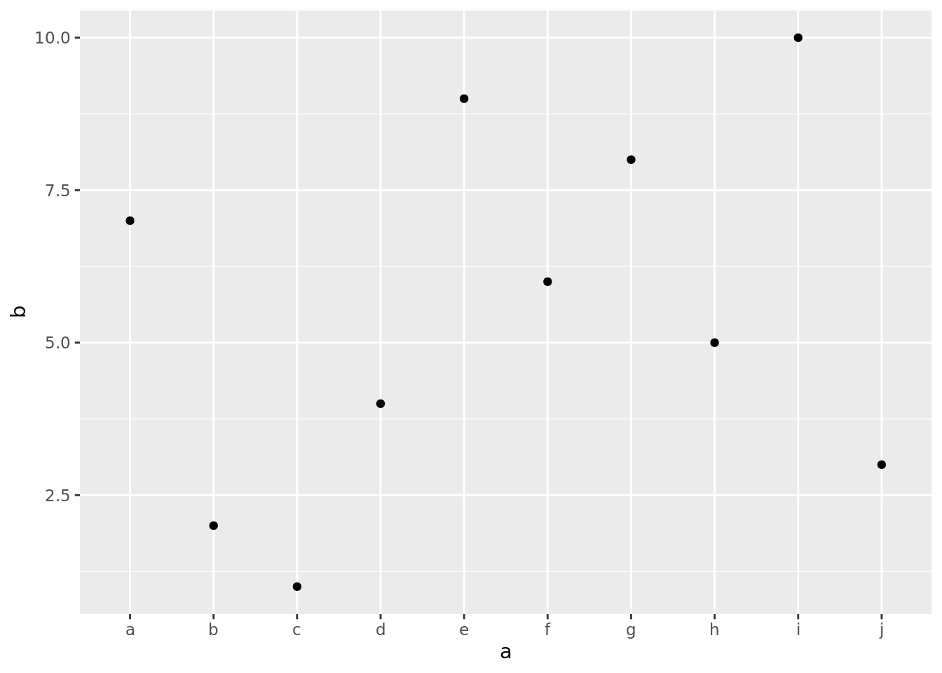
A little bit less basic plot, as points can be categorised by their colors:
ggplot(data = sample_data, mapping = aes(x = a, y = b, color = color)) +
    geom_point()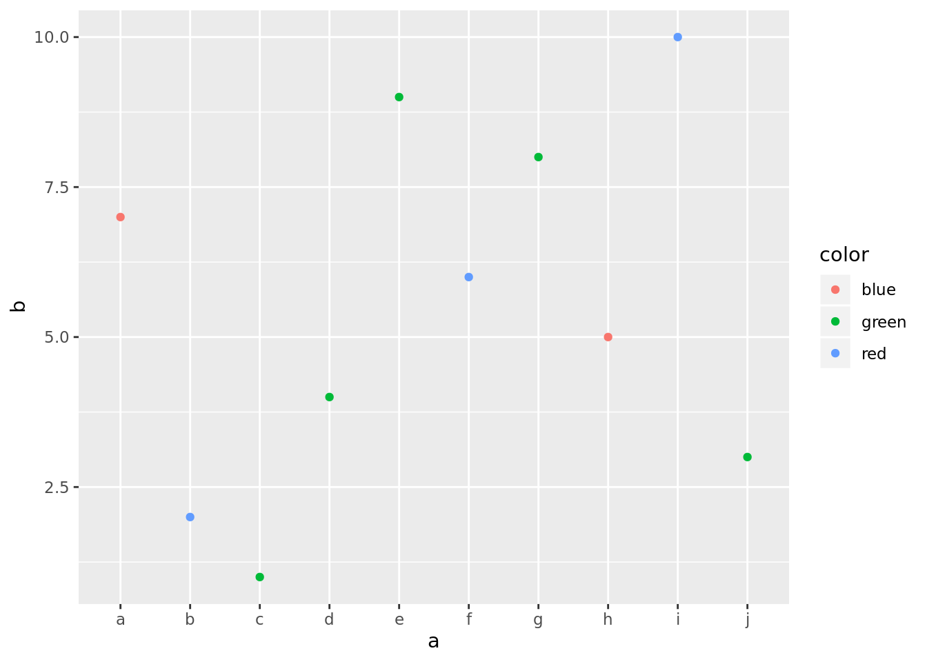
As you can see, colors do not match their descriptions, but you can customise it.
Here’s another way of separating categories:
ggplot(data = sample_data, mapping = aes(x = a, y = b)) +
    geom_point() +
    facet_wrap(~ color, nrow=1)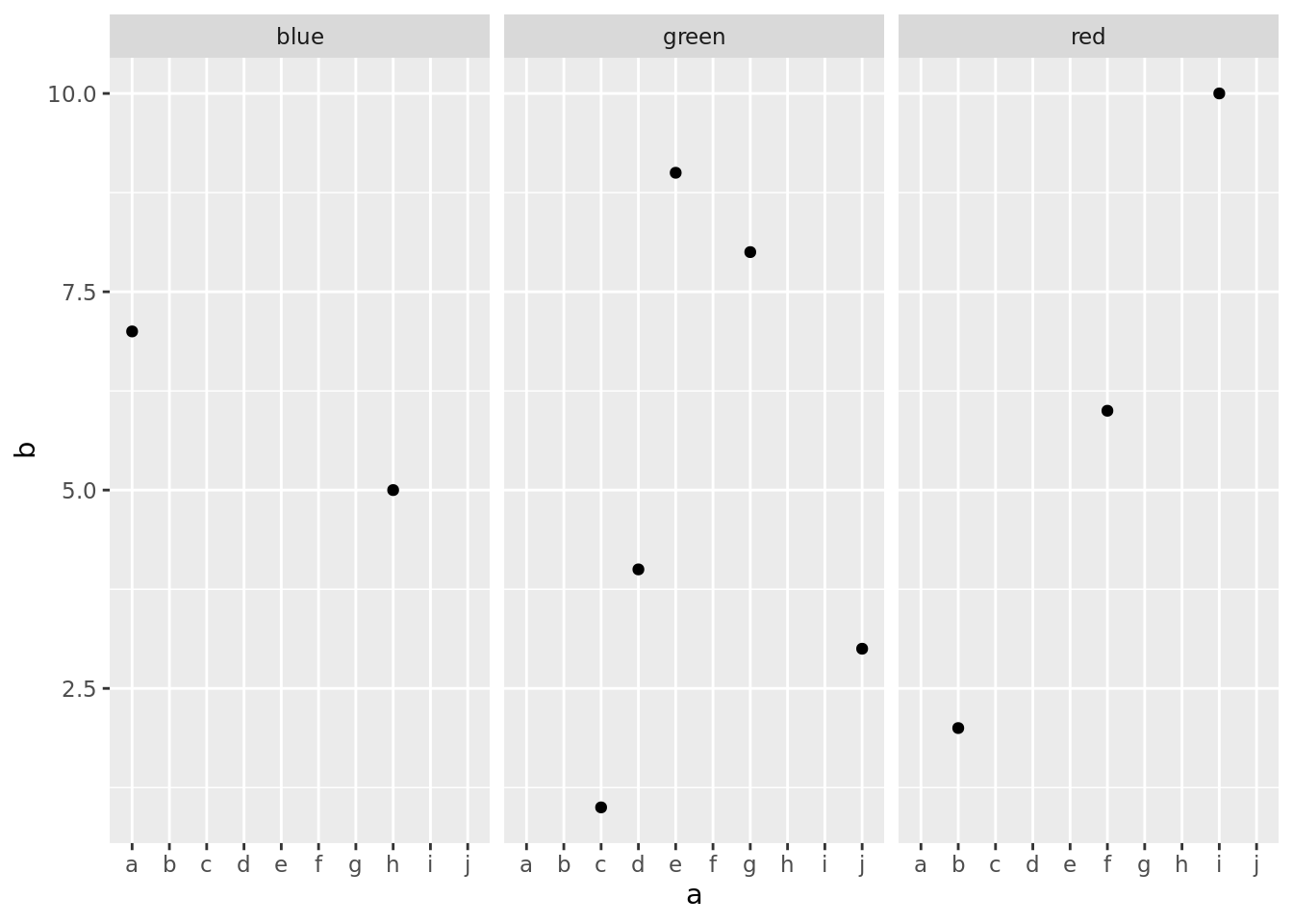
Combining multiple types of plots
We’ll use a dataset mpg which is available in ggplot2 package.
ggplot(data = mpg) +
    geom_smooth(mapping = aes(x = displ, y = hwy, color = drv, linetype=drv)) +
    geom_point(mapping = aes(x = displ, y = hwy, color = drv))
## `geom_smooth()` using method = 'loess' and formula 'y ~ x'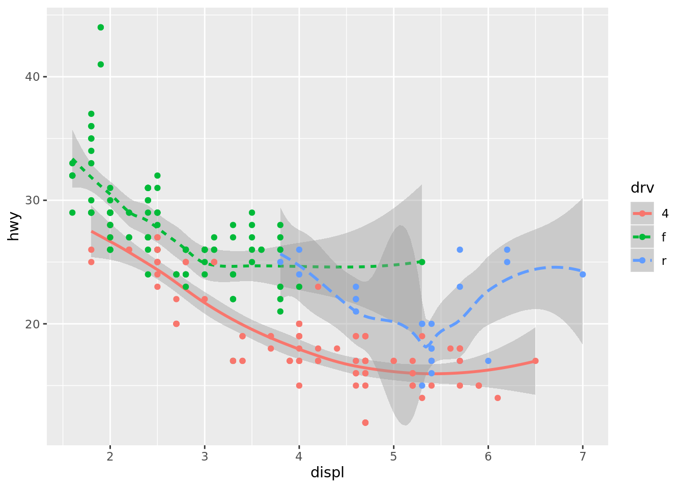
Smoothing may be useful if you want to show trend.
You can have different mapping for every plot:
ggplot(data = mpg, mapping = aes(x = displ, y = hwy)) +
    geom_point(mapping = aes(color = class)) +
    geom_smooth()
## `geom_smooth()` using method = 'loess' and formula 'y ~ x'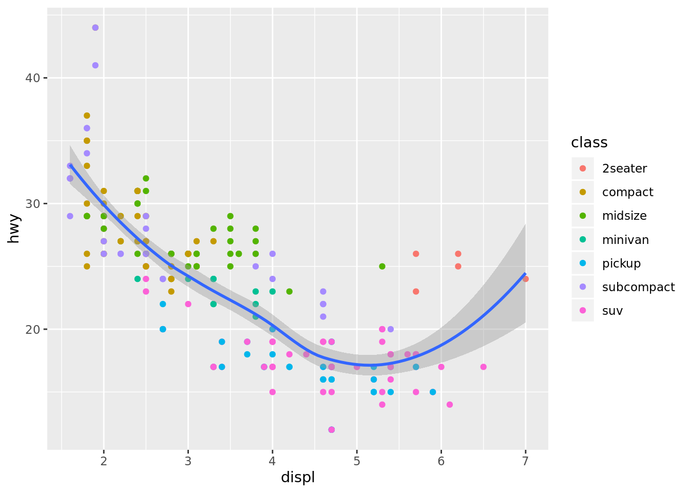
Different datasets are also possible, but rather unusual.
Bar plots
The simplest bar plot:
ggplot(data = sample_data) +
    geom_bar(mapping = aes(x = a, y = b), stat = "identity")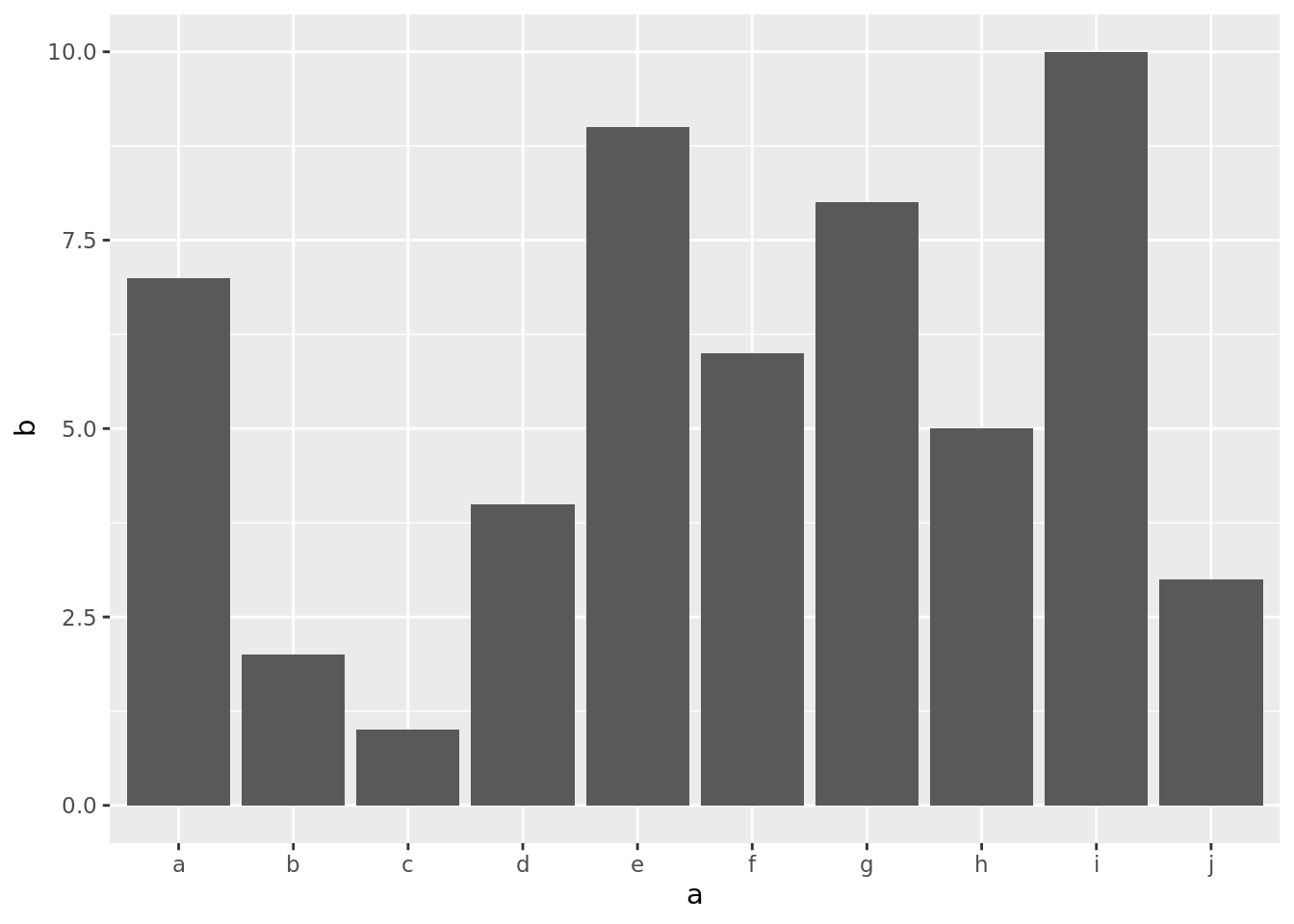
We had po provide the argument stat = "identity", becasue the default behaviour is to plot the size/count of every category (x).
Stacked bar plot:
ggplot(data = sample_data, mapping = aes(x = color, y = b, color = a)) +
    geom_bar(stat = "identity", fill = NA)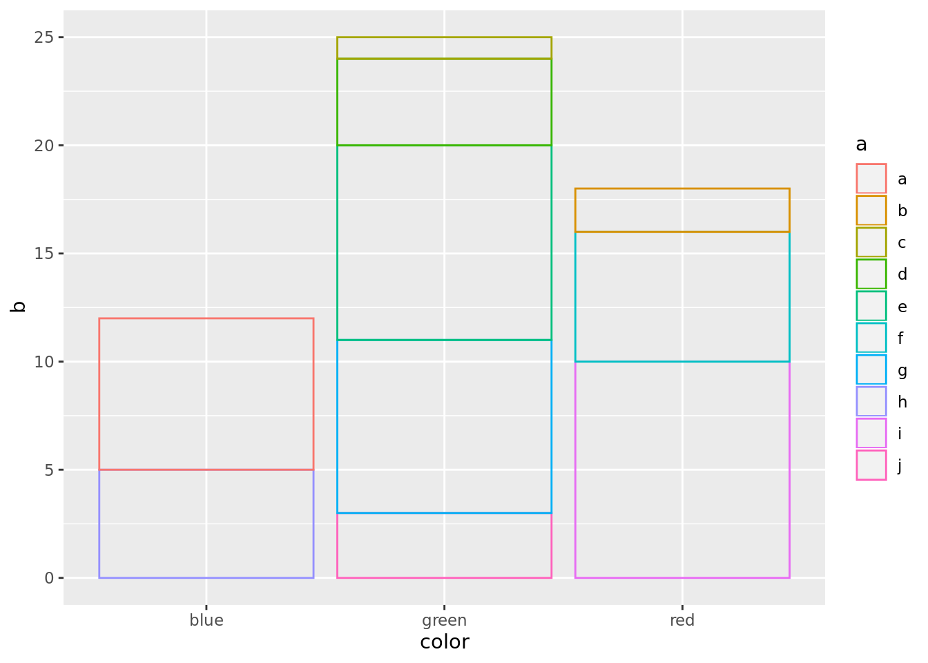
Boxplot
Let’s use mpg data again:
ggplot(data = mpg, mapping = aes(x = class, y = hwy)) +
    geom_boxplot() +
    coord_flip()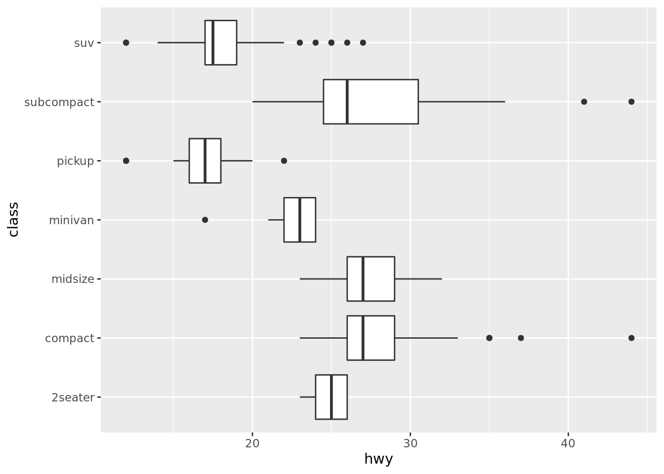
We also used coord_flip(), which rotates the plot by 90 degrees, or, another words, flips the coordinates.
Maps
Let’s draw quickly a map of the USA:
usa <- map_data("usa")
ggplot(usa, aes(long, lat, group = group)) +
    geom_polygon(fill = "white", color = "black") +
    coord_quickmap()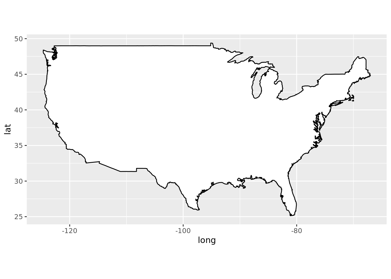
We used two interesting functions:
map_data()- a ggplot2’s function, which provides spatial data for a few countries in the world;coord_quickmap()- adjusts the size of a plot to the size of map. Default settings cause the opposite.
Other functions example
Here’s a weird plot, which aims at presenting various customisation examples:
ggplot(data = mpg, mapping = aes(x = cty, y = hwy)) +
    geom_rect(mapping=aes(xmin=15, xmax=20, ymin=0, ymax=max(hwy)),
              fill='blue', alpha=0.1) +
    geom_point() +
    labs(title = "Some plot",
         subtitle = "subtitle to chart",
         caption = "and caption: made by me",
         x = "city miles per gallon",
         y = "highway miles per gallon") +
    geom_abline(color ="red") +
theme_bw() 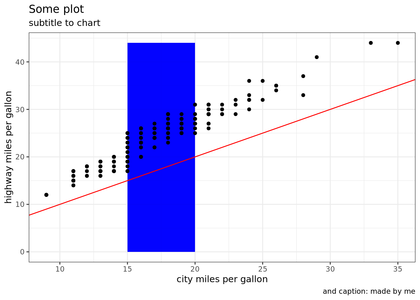
    theme(plot.title = element_text(hjust = 0.5, size=12),
          axis.title = element_text(size=12))
## List of 2
## $ axis.title:List of 11
## ..$ family : NULL
## ..$ face : NULL
## ..$ colour : NULL
## ..$ size : num 12
## ..$ hjust : NULL
## ..$ vjust : NULL
## ..$ angle : NULL
## ..$ lineheight : NULL
## ..$ margin : NULL
## ..$ debug : NULL
## ..$ inherit.blank: logi FALSE
## ..- attr(*, "class")= chr [1:2] "element_text" "element"
## $ plot.title:List of 11
## ..$ family : NULL
## ..$ face : NULL
## ..$ colour : NULL
## ..$ size : num 12
## ..$ hjust : num 0.5
## ..$ vjust : NULL
## ..$ angle : NULL
## ..$ lineheight : NULL
## ..$ margin : NULL
## ..$ debug : NULL
## ..$ inherit.blank: logi FALSE
## ..- attr(*, "class")= chr [1:2] "element_text" "element"
## - attr(*, "class")= chr [1:2] "theme" "gg"
## - attr(*, "complete")= logi FALSE
## - attr(*, "validate")= logi TRUE3. Curiosities
plotly
If you want to publish a plot on your website, consider using plotly:
p <- ggplot(sample_data, aes(x=a, y=b)) +
    geom_point()

plotly::ggplotly(p)
as it will give your plot interesting interactive features. Shiny users will appreciate them.
ssh
When you work on a remote machine and connect to it via ssh, the plots you create will not appear in pop-up windows by default. In order to do this, add the -X flag when connecting to server:
ssh -X user@login4. Useful links
R for Data Science - a very good book for plotting in ggplot2. A few examples in this tutorial were inspirded by it.
R Graphics Cookbook - looking for a quick answer? This is the right place for you.
